22.01.2026
From Global to Regional Explanations: Understanding Models More Locally
MCML Research Insight - With Giuseppe Casalicchio, Thomas Nagler, and Bernd Bischl
Machine learning models can be powerful, but understanding why they behave the way they do is often much harder. Early global interpretability tools were designed to show how each feature affects the model’s final outcome. But these tools typically work by averaging over the entire dataset, however averages can often hide important structure.
«When models behave differently across subgroups, a single global explanation can tell the wrong story.»
Giuseppe Casalicchio
MCML Junior Member
As an example, think of bike-rental predictions. If you compute a single global feature effect explanation over all riders, the result might show that “on average, bike sharing demand increases at noon”. But this averaged view can be misleading: commuters spike at 8am and 6pm, while weekend riders peak around lunchtime. Averaging these groups washes out both patterns and yields an explanation that fits neither group well.
This is the central problem that the paper “Decomposing Global Feature Effects Based on Feature Interactions” by MCML Junior Member Giuseppe Casalicchio and MCML PIs Thomas Nagler and Bernd Bischl, along with former member Julia Herbinger and collaborator Marvin N. Wright, tackles. The authors propose a simple but powerful idea: GADGET (Generalized Additive Decomposition of Global EffecTs). Instead of using one single global explanation for a heterogeneous population, find meaningful subgroups with more homogeneous effects and provide subgroup-specific explanations that are accurate within each subgroup.
«GADGET chooses the split that most reduces the total disagreement across the features you care about. In the resulting leaves, local effects have small variance, which means the model is well approximated by an additive form, and regional PD/ALE/SHAP plots become reliable summaries.»
Giuseppe Casalicchio
MCML Junior Member
Why Global Explanations Fall Apart
Traditional global explanation tools summarize model behavior by averaging. This is most useful when the model behaves similarly across all observations. When there are interactions, which mean the effect of one feature depends on another, these averages become misleading.
To see this, it helps to understand what the main tools show:
-
Partial Dependence (PD) plots show how predictions change as one feature varies on average. If features are correlated, PD can reflect extrapolation to unrealistic feature combinations, which can further distort the averaged effect.
-
Individual Conditional Expectation (ICE) curves are the individual lines behind PD: for each observation, vary the feature while holding all other features fixed. ICE makes it visible that not everyone follows the same trend, each line represents one person, day, or situation.
-
Accumulated Local Effects (ALE) plots build a global effect from local prediction changes computed where data exist, so they stay close to the observed feature distribution. Unlike PD, ALE avoids averaging over potentially unrealistic feature combinations under correlation. The main ALE curve summarizes the typical effect, and heterogeneity can be assessed by plotting the spread of the per-observation local effects; large spread or spikes indicate unstable, interaction-driven, or subgroup-specific behavior.
-
SHapley Additive exPlanations (SHAP) assigns credit to each feature for a single prediction, telling us how much each feature contributed to the overall prediction relative to a baseline. But when averaged globally, SHAP plots can also blur differences caused by interactions.
All of these tools point to the same issue: the model contains subgroups that react differently, and averaging them together hides the real story.
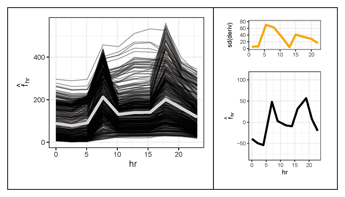
©Herbinger et al.
Figure 1: Global view before splitting: Understanding feature effects before identifying subgroups. Left: Global Partial Dependence (PD) for hours with ICE curves (thin black lines), showing how individual observations respond as the hour varies. Their average (bold gray line) summarizes these responses, but the wide variety of ICE shapes reveals strong interactions with other features. Right: Global Accumulated Local Effects (ALE) for hour (bottom). The orange curve (top) shows the dispersion of local effects across observations, which is the standard deviation of the local derivatives. High dispersion indicates that the effect of hour differs substantially across the dataset, suggesting hidden subgroups with distinct patterns.
«GADGET refines the granularity of interpretability: it decomposes global summaries into coherent regional narratives.»
Giuseppe Casalicchio
MCML Junior Member
The Idea Behind GADGET
GADGET offers a simple intuition: instead of averaging over conflicting behavior, identify regions where the model behaves consistently and explain those regions separately. Inside these regions, everything becomes clearer: ICE curves line up smoothly, ALE curves sharpen, and the dispersion curve drops. This means heterogeneous effects induced by interactions have been separated from each other, and standard plots finally reflect how the model actually behaves.
To achieve this, GADGET iteratively partitions the data. At each step, it tries a set of candidate splits: simple ways of dividing the data, like working day vs. non-working day, or low vs. high temperature. It then chooses the split that reduces disagreement in local feature effects the most. Splitting stops once further divisions no longer improve consistency.
A small helper, PINT (Permutation-based Interaction Test), can flag which features truly show interaction-driven variability. GADGET then focuses on these features, making the process more stable and efficient. The final result is a set of regions where the model is well-approximated by simpler, additive relationships, which makes explanations trustworthy again.
A Simple Example: Bikeshare Demand
Take the case of the aforementioned bike-rental data, where the global curve for “hour” produces a confusing midday bump that reflects no real behavior. GADGET quickly finds the first meaningful split: working vs. non-working days. Once separated, two clear patterns emerge, like weekday riders show sharp morning and evening commute peaks, while non-working days shift demand toward midday. A second split by temperature refines the weekday pattern even further.
In this way, a single blurry global effect becomes two clean, intuitive regional explanations.
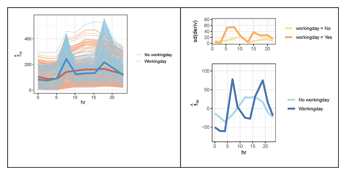
©Herbinger et al.
Figure 2: Regional explanations after splitting by working day Recovering meaningful subgroups with clearer, more stable patterns. Left: Regional ICE and PD curves after splitting the data into working-day and non-working-day groups. Right: Regional ALE for hour after the same split.
Why This Matters
This approach transforms interpretability. Instead of one vague global picture, GADGET reveals where and for whom the model behaves differently. For practitioners, this is far more actionable. In domains like healthcare, risk modeling, and education, knowing which subgroups behave differently is often more important than any overall trend.
GADGET integrates naturally with existing tools, making PD, ALE, and SHAP dependable again by giving them the right “context” in which to operate.
Takeaway
GADGET refines model interpretability and behaviour understanding by breaking global summaries into clear, coherent regional narratives. It is model-agnostic, simple to use, and designed to make explanations honest and intuitive. The accompanying JMLR article provides the full framework, theory, case studies, and reproducible code.
If you’d like to learn more about GADGET, the full paper and implementations are available below. The work was published in the Journal of Machine Learning Research (JMLR), one of the leading open-access journals in machine learning.
Decomposing Global Feature Effects Based on Feature Interactions.
Journal of Machine Learning Research 25.381. Dec. 2024. URL
Share Your Research!
Get in touch with us!
Are you an MCML Junior Member and interested in showcasing your research on our blog?
We’re happy to feature your work—get in touch with us to present your paper.
Related


09.04.2026
Nikita Araslanov Receives Prestigious Emmy Noether Grant
Nikita Araslanov, MCML Junior Member, awarded Emmy Noether Grant to establish an independent AI research group at TUM.